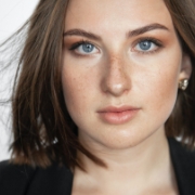
Avatar
The Avatar component is used to represent a user, and displays the profile picture, initials or fallback icon.
Shapes
Default avatar is square in shape. For rounded and circle avatar add .avatar-rounded modifier classes respectively.
Sizing
Fancy larger or smaller avatar? Add .avatar-xl, .avatar-lg, .avatar-md, .avatar-sm or .avatar-xs for additional sizes. For custom sizes use sizing utilities - e.g. d-14 or d-20.
Indicators on avatar
Fancy larger or smaller avatar? Add position-relative and position classes with badge Indicators.
Badge on avatar
Fancy larger or smaller avatar? Add position-relative and position classes with badge.
1010555555Avatar with initials
Wrap .initial-wrap with .avatar classess.
Avatar with Icons
Add icons inside .initial-wrap classes.
Avatar color option
Add color classes like .avatar-primary,.avatar-info with avatar.
Avatar soft
Add soft color classes like.avatar .avatar-soft-* for soft colors.
Avatar with logo
Use .avatar-logo with avatar.
Groups
In need of an avatar, but not the image avatar? Replace the default modifier class with avatar-group avatar-group-* ones to create avatar with name initials.
Overlapped Avatar Group
For overlapped group of avatars replace default modifier class with .avatar-group-overlapped.